The Nation. Shifting paradigms. Opening Minds.
The Nation engaged Athletics to help reinforce and amplify The Nation’s position at the forefront of progressive political and cultural discourse through a modernized site experience and dynamic storytelling. The Nation’s intuitive and inviting editorial platform is designed to engage more deeply with new and existing users while celebrating its modernity and relevance. This encompassed re-envisioning The Nation’s brand behaviors for digital while improving user journeys, taxonomies, simplifying article types, and increasing subscriptions and conversion.
Services: Brand Identity, Experience Design, Motion Design
Credits
Client: The Nation
Agency: Athletics
CCO: Malcolm Buick
CD: Daniel Irizarry
ACD: Allison Connell
Strategy: Katherine Lee, Ku Adofo-Mensah
Design: Katie Mias, John Keough
CM: Kathryn Farwell, Moyna Ghosh
Type Design: Tré Seals, Vocal Type
Technology: Jameson Proctor, Britton Walker, Heather Cavanaugh, Ross Leube
The Leader in Progressive Political Discourse
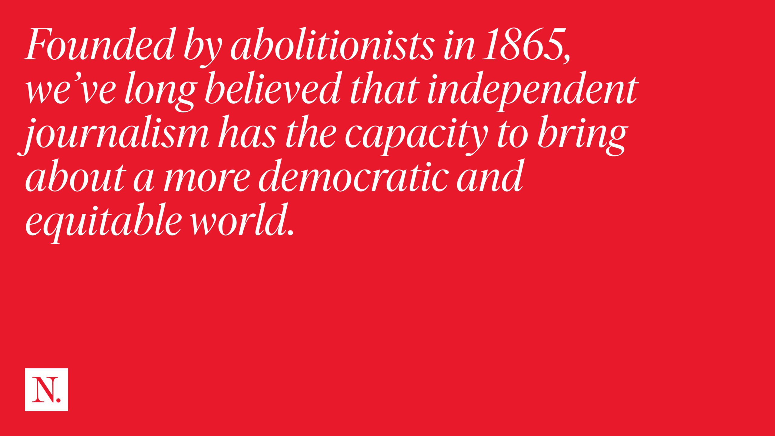
For over a century, The Nation has championed progressive ideas, democratic politics, women’s rights, racial and economic justice, and peace. Founded by abolitionists in 1865, it upholds the belief that independent journalism can foster a more democratic and equitable world. Today, The Nation continues to thrive as a 21st-century publication by nurturing young writers, appealing to young readers, and engaging with contemporary issues and movements that resonate with current and future generations.
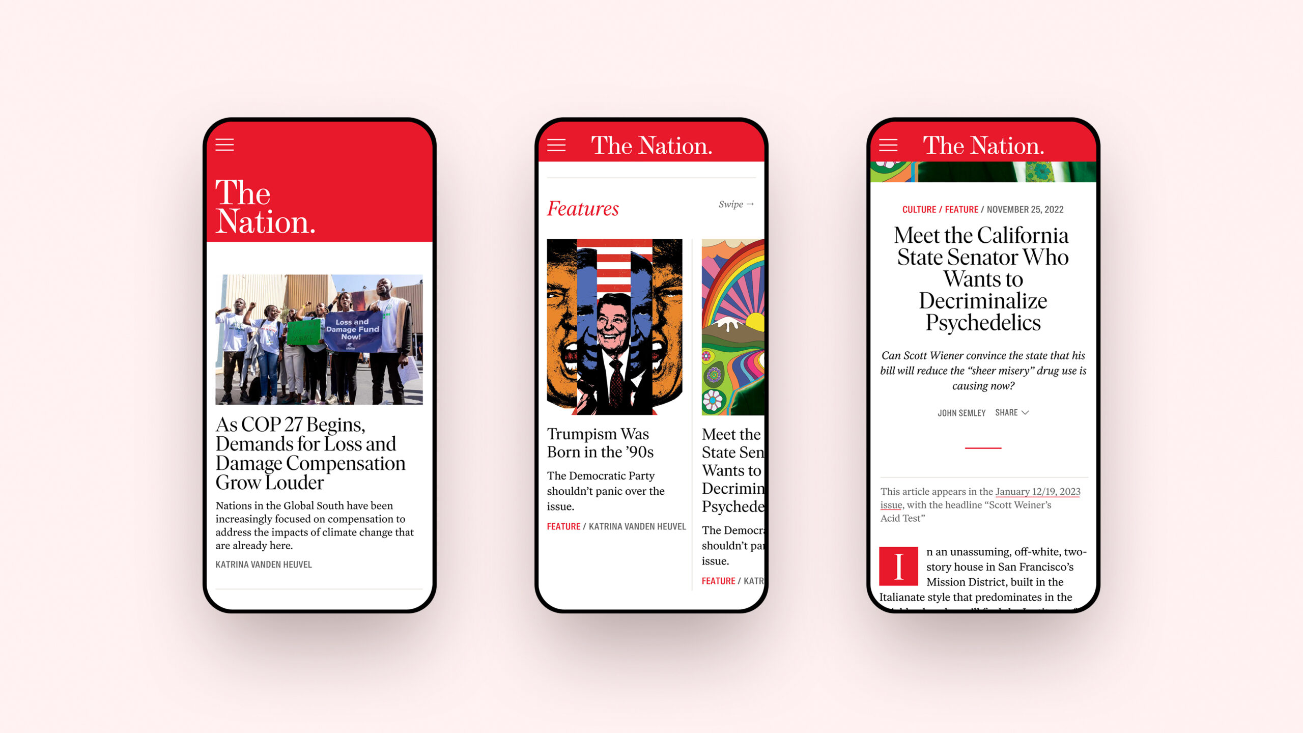
The Nation's mobile navigation is designed to be equally comprehensive and intuitive.
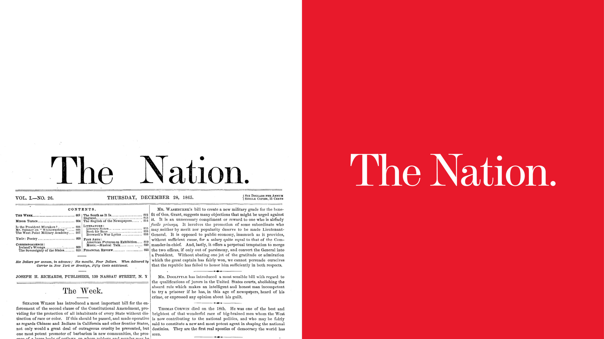
The Nation brand is contemporary but does not shy away from its heritage. Its large masthead and a strong use of scale allow The Nation to be bold and imaginative while retaining clarity and precision.
Purposeful by design
The Nation’s signature red is the driving signifier for both brand recall as well as key actions. The openness of the white printed page is retained in digital while red rules are used for information delineation. A secondary palette has been introduced to help bring optimism and visual flexibility without overwhelming The Nation’s core brand colors.

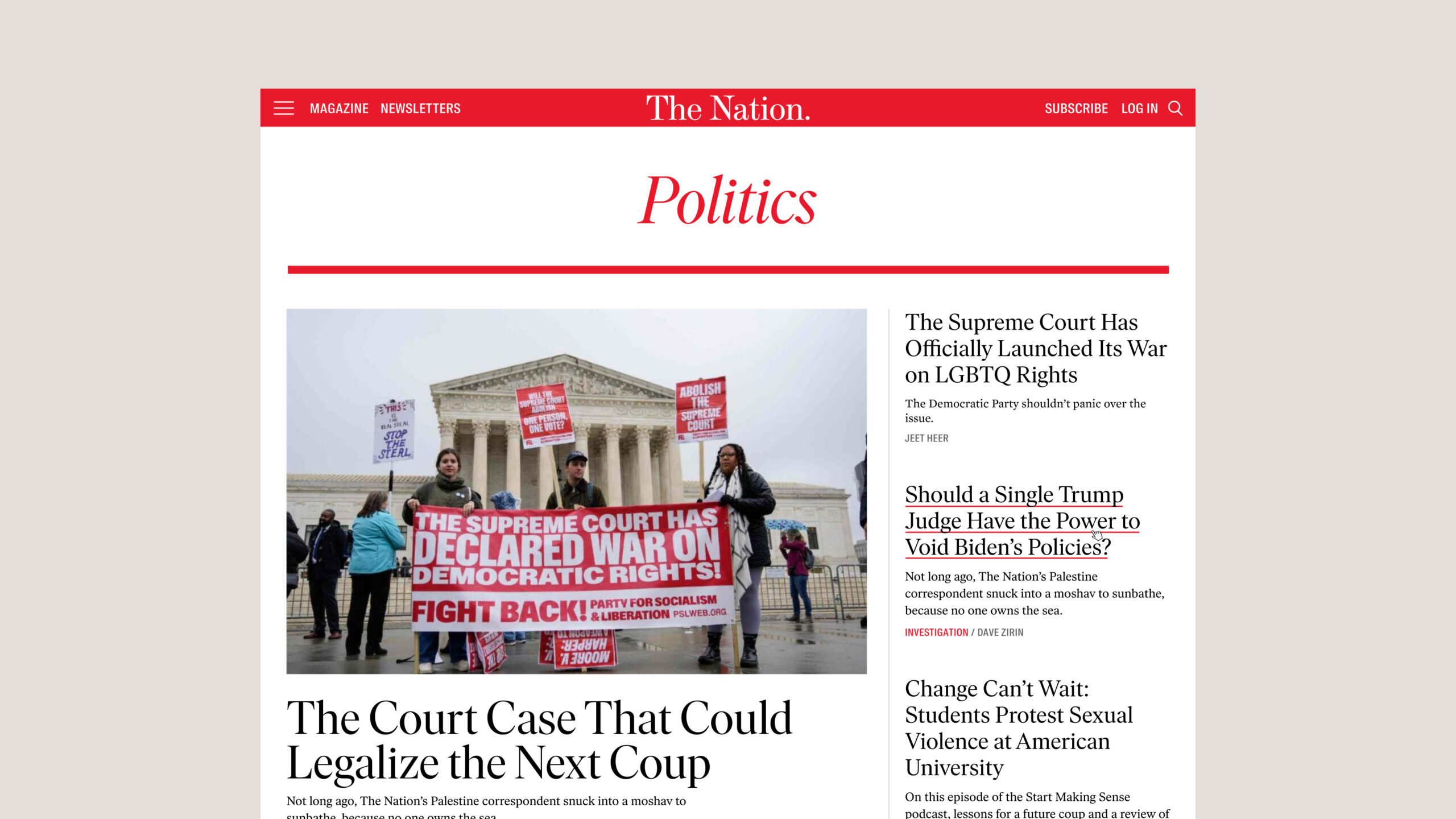
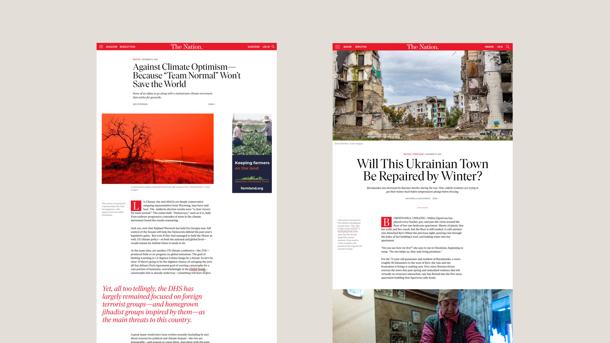
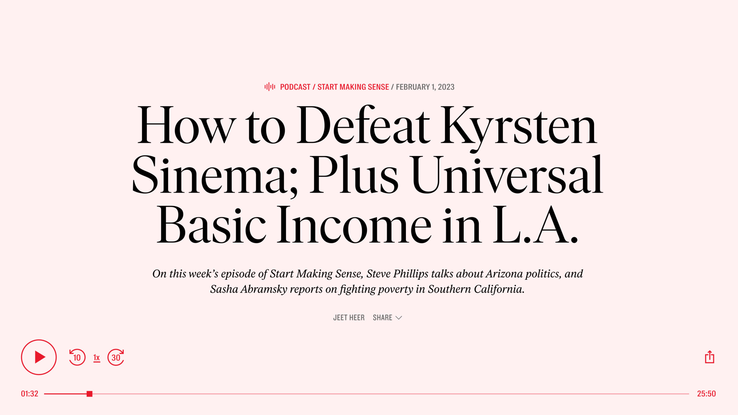
The Nation’s flexible architecture is designed to respond to breaking news, big announcements, and thematic suites of articles. The site is driven by content versatility. Political and cultural news, opinion, and analysis that The Nation is renowned for can be easily organized while preserving advertisement modules.
"As our country and the world undergo extraordinary and tectonic shifts, these times demand that The Nation be ever bolder, willing to unleash our imaginations and ready to think anew. ”
Katrina vanden Heuvel. Editorial Director & Publisher of The Nation
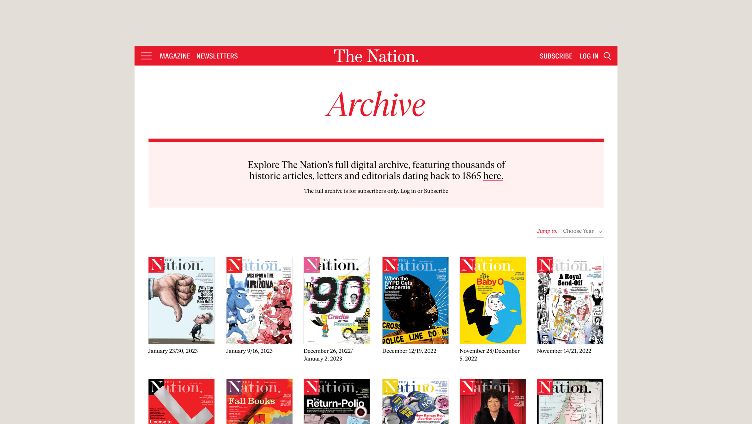
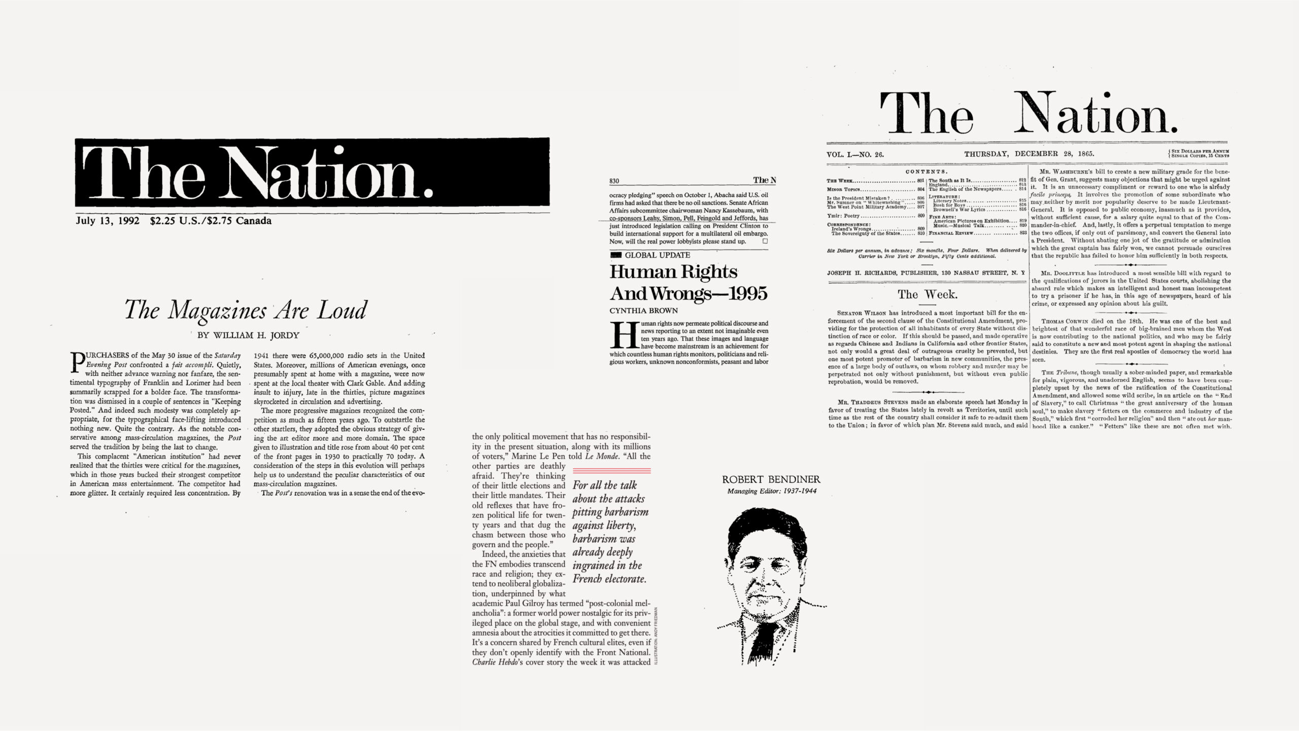
Athletics and The Nation worked with Tré Seals of Vocal Type to update The Nation's wordmark to to be more iconic and legible in digital formats while retaining a reference to its long history and original masthead. A flexible approach to the utilization of the word mark was developed to better accommodate responsiveness and scaling.
Looking beyond the page
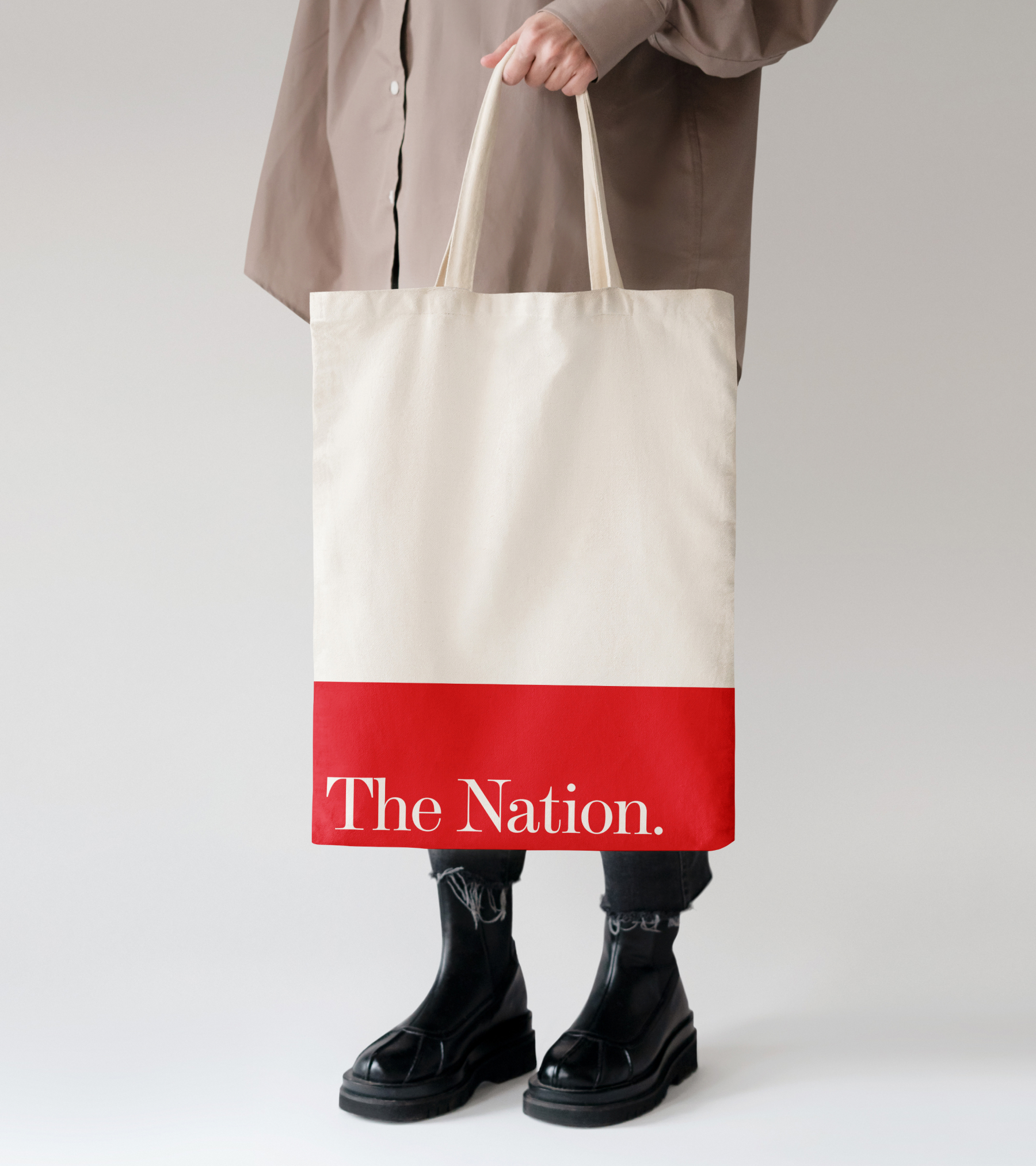
In the process of developing The Nation’s site experience, Athletics explored how the Nation brand could be expressed beyond digital. The Nation’s refreshed word mark is a strong, elegant, and timeless expression of it’s mission: The Nation speaks truth to power to build a more just society.
DANIEL IRIZARRY
EMAIL —
the.daniel.irizarry@gmail.com
© 2025 Daniel Irizarry All Rights Reserved
All company, product, service names, logos, and brands are property of their respective owners and are for identification purposes only. Use of these names, logos, and brands does not imply endorsement.
