ShareFile
ShareFile, a rapidly growing business known for its secure and easy digital document sharing, was acquired by Citrix in 2011. Over a decade later, ShareFile separated from Citrix to refocus its brand on the human elements of a modern client experience. Athletics was tapped to create a new brand emphasizing how ShareFile simplifies workflows, communication, enhances collaboration, and automates repetitive tasks, putting people at the center of its evolved focus to help customers and their clients do their best work.
Services: Brand Identity, Experience Design, Motion Design
Credits
Client: ShareFile
Agency: Athletics
CCO: Malcolm Buick
CD: Daniel Irizarry
ACD: Allison Connell
Strategy: Katherine Lee, Liam Powell, Ku Adofo-Mensah
Design: Boyang Xia, Hampton Dunlap, Cillian Carroll, Zachery Eng, John Keough, Kristen Barry, Jaime Patiño Calvo
CM: Nathan Brouillet, Tricia Vuong
Technology: Phase 2, Jameson Proctor, Ross Leube, Richard Lehmann
Partners: Colors and The Kids (3D), Autumnline, (Anthem Video), Petra Sitaru (Illustration)
A Layered System
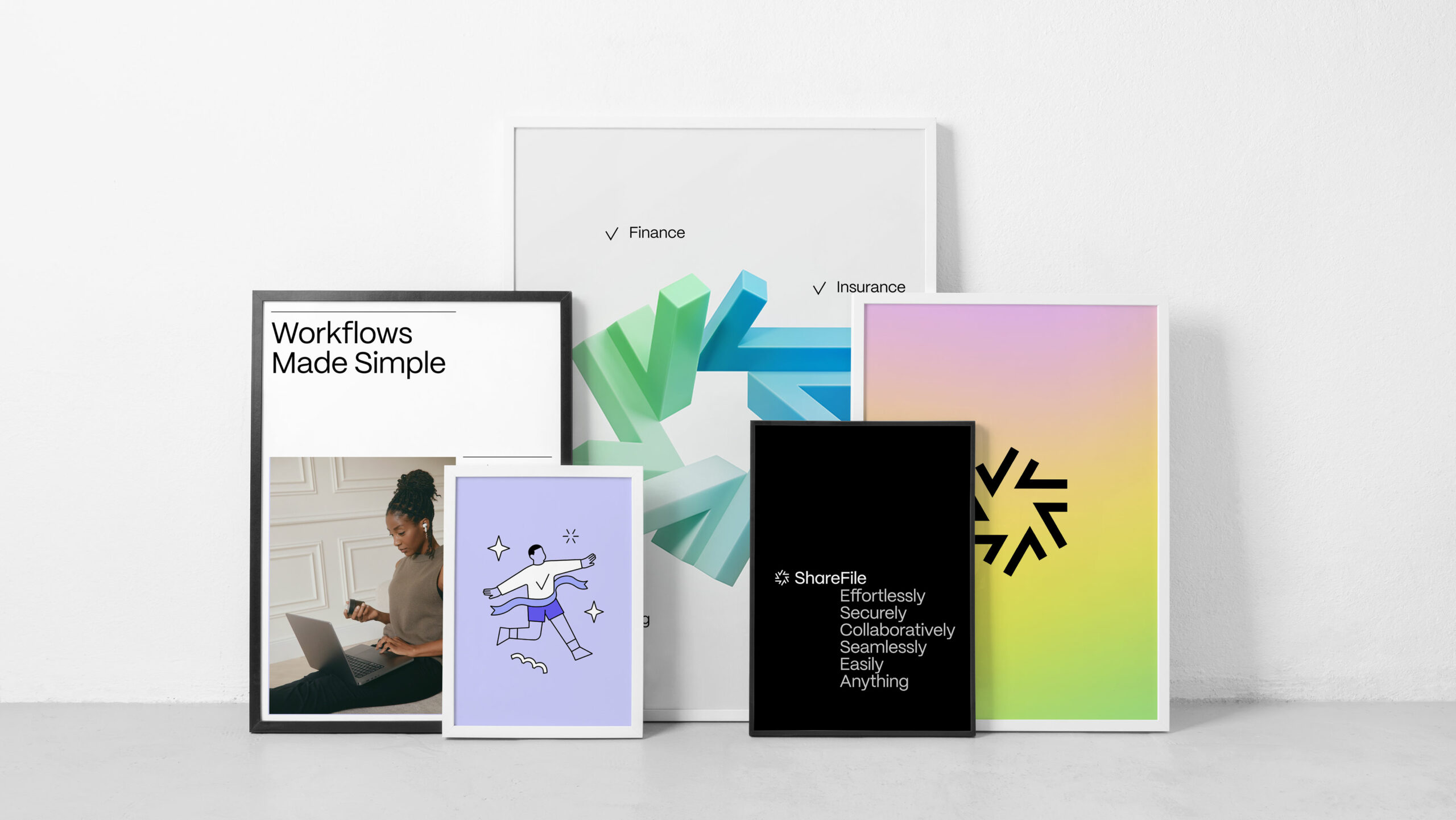
The brand system would use a varied taxonomy of assets and media for a textured, engaging experience. Animated shapes in abstract, 3D planes evoke flow and ease, while warm portraiture of people in homey working environments paint an authentic portrait of contemporary work life. Spot illustrations are used to dramatize key value propositions and add playfulness and humor to the whole of the system.

A Dynamic Symbol
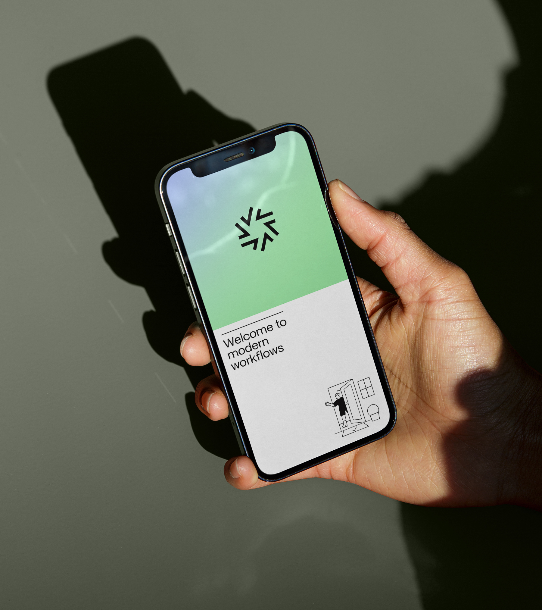
To tell a story of forward motion, of flow, and the joy of completing one task after another, we developed a logomark composed of checkmarks. Each individual check comes to life in a variety of ways, animating into a vibrant star or flywheel. Combined with our full wordmark, it makes for a dynamic pairing.
Color and Flow
A primary palette of neutrals and supportive pops of color provide a flexible foundation for the brand system, and any communications it’s applied to. Gradients are used to draw the user in, adding texture and emotional resonance to applications, and serve as a dynamic background for other brand assets.
Just the Right Type
Drawn by Pangram Pangram Foundry, PP Mori is a versatile and sophisticated gothic sans serif inspired by contemporary Japanese design. The foundation for our wordmark, it’s highly functional & unique, with playful diacritics and punctuations.
In their Element
Our photographic approach would begin with warm portraiture. Featuring people in relatable work environments – the home, or home like offices — it allows us to tell stories around real personas and solid, credible use cases, and brings human warmth to a tech space saturated with product screens. We want above all to highlight moments of connection, joy, and thoughtfulness, pushing beyond what we think of when we think, “people at work.”
Productivity in Motion
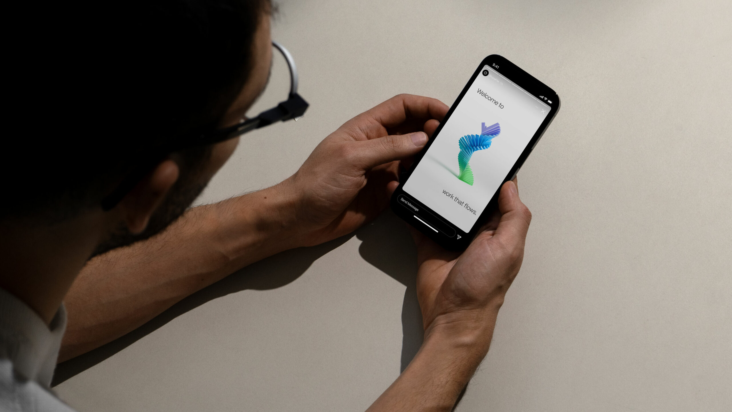
A full suite of 3D assets, featuring both abstract shapes and those inspired by our symbol, play in the same emotional and aspirational space that our gradients do. Playing a crucial role in our system, 3D assets tell a variety of stories, from visualizing how ShareFile works as a product and communicating benefits, to giving form to abstract ideas like process, collaboration, sharing, and flow.
“Digital innovation has created huge new opportunities to enhance customer experience and simplify interaction workflows.”
Kurt Heusner, General Manager and SVP, ShareFile

Spot-On Illustration
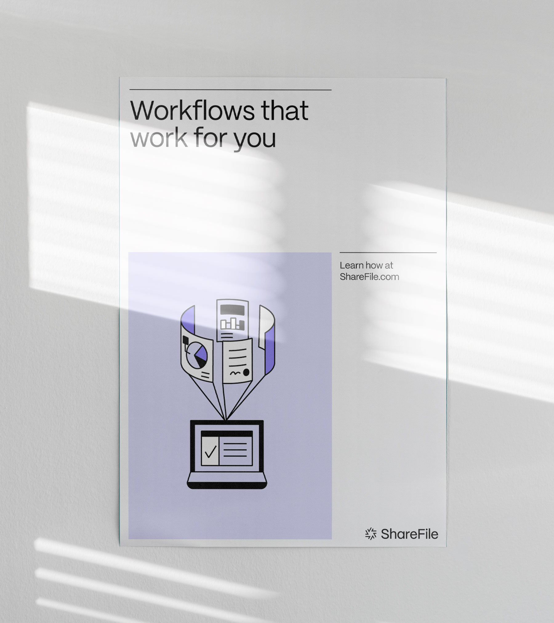
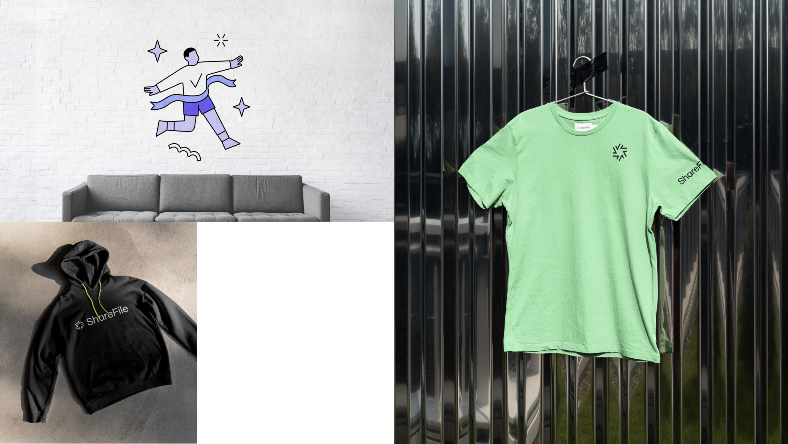
A library of spot illustrations — standalone images that draw attention to a specific detail — breathe life into our value proposition, while bringing a deeper layer of warmth and approachability to the brand system. They help streamline complex narratives around client challenges and product benefits.
A Vibrant Digital Ecosystem
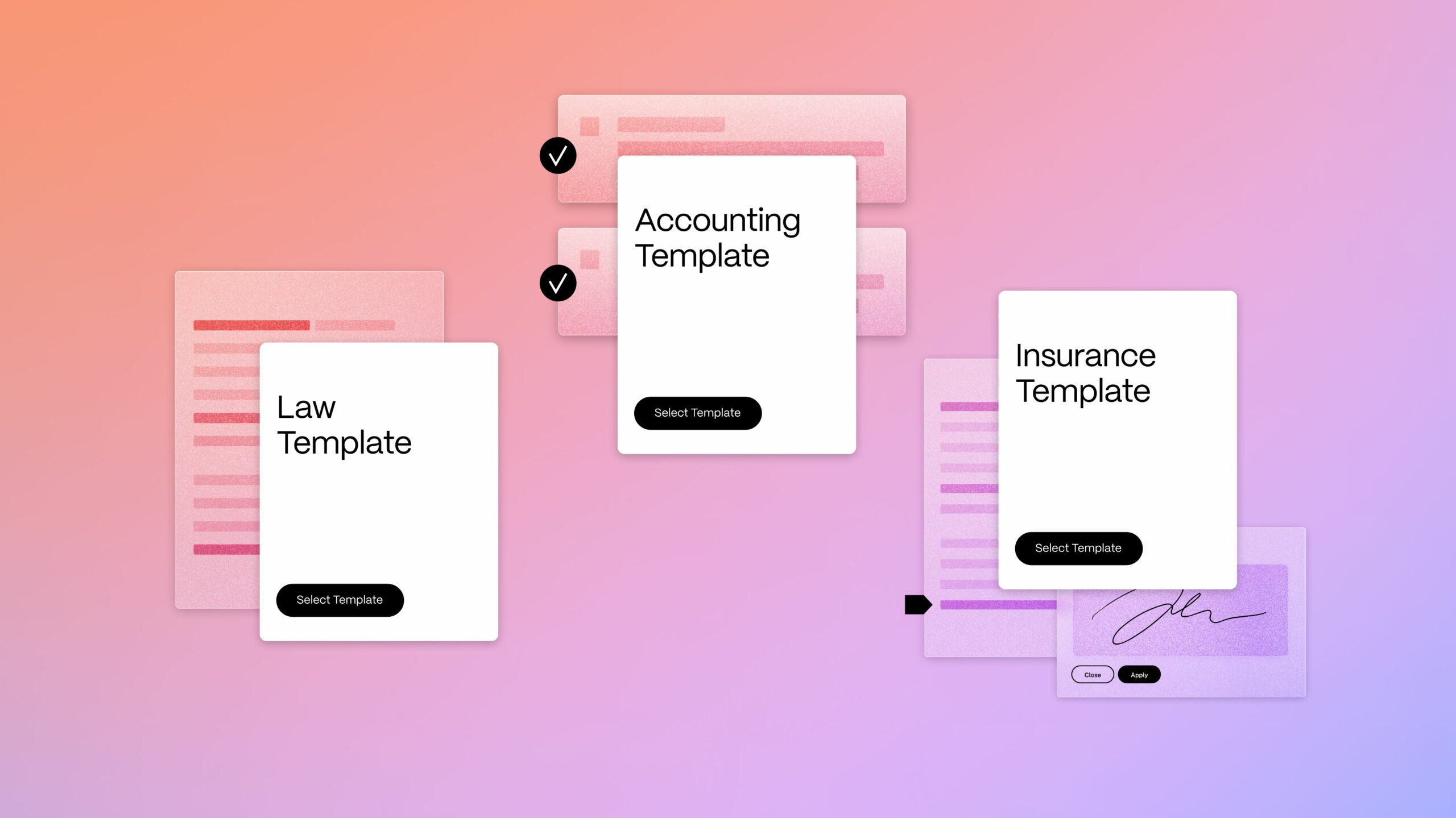
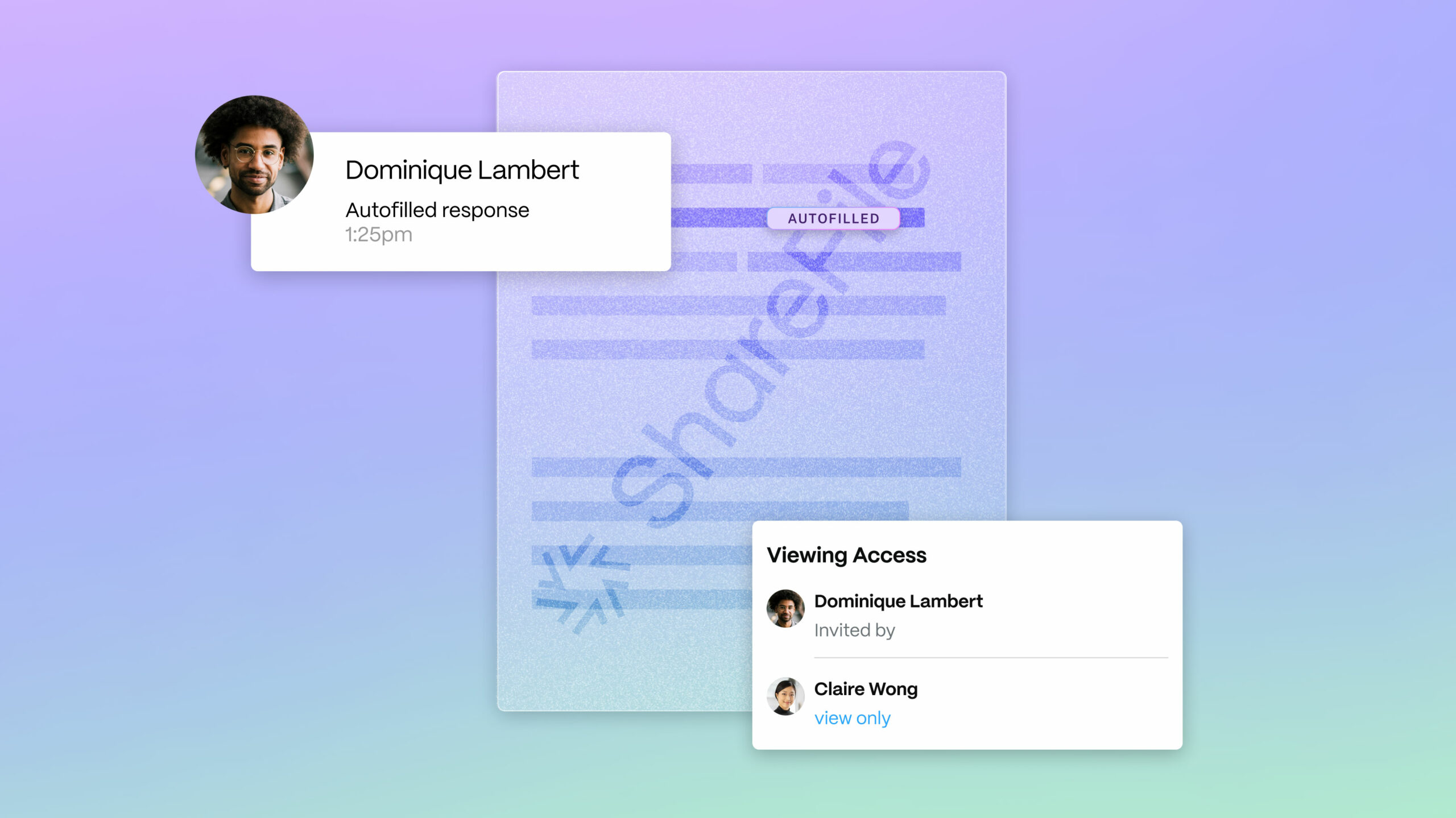
The whole of the system comes to vibrant life in digital application — the ShareFile website, for one, but also in product UI itself. To represent and animate product, we developed a spectrum of illustration: on one end, a deeply functional, neary 1:1 depiction of product screens; in the middle, several abstracted elements of UI that tell a more focused feature story; and on the other end, an expressive fusion of photography, illustration, and UI elements.
A Full Motion Toolkit
Considering the vital role that motion plays in the brand system, we developed a toolkit and explicit guidelines for its deployment. Working with ShareFile around several key milestones on their marketing calendar, we soon got to deploy the toolkit in full, with several reels & anthem videos that were scripted, designed, and developed to activate the rebrand in full.
DANIEL IRIZARRY
EMAIL —
the.daniel.irizarry@gmail.com
© 2026 Daniel Irizarry All Rights Reserved
All company, product, service names, logos, and brands are property of their respective owners and are for identification purposes only. Use of these names, logos, and brands does not imply endorsement.


