Truist
Truist, the merger of SunTrust and BB&T banks, had ambitions to make financial services better – and to do it, they needed an identity that was trustworthy and visionary.
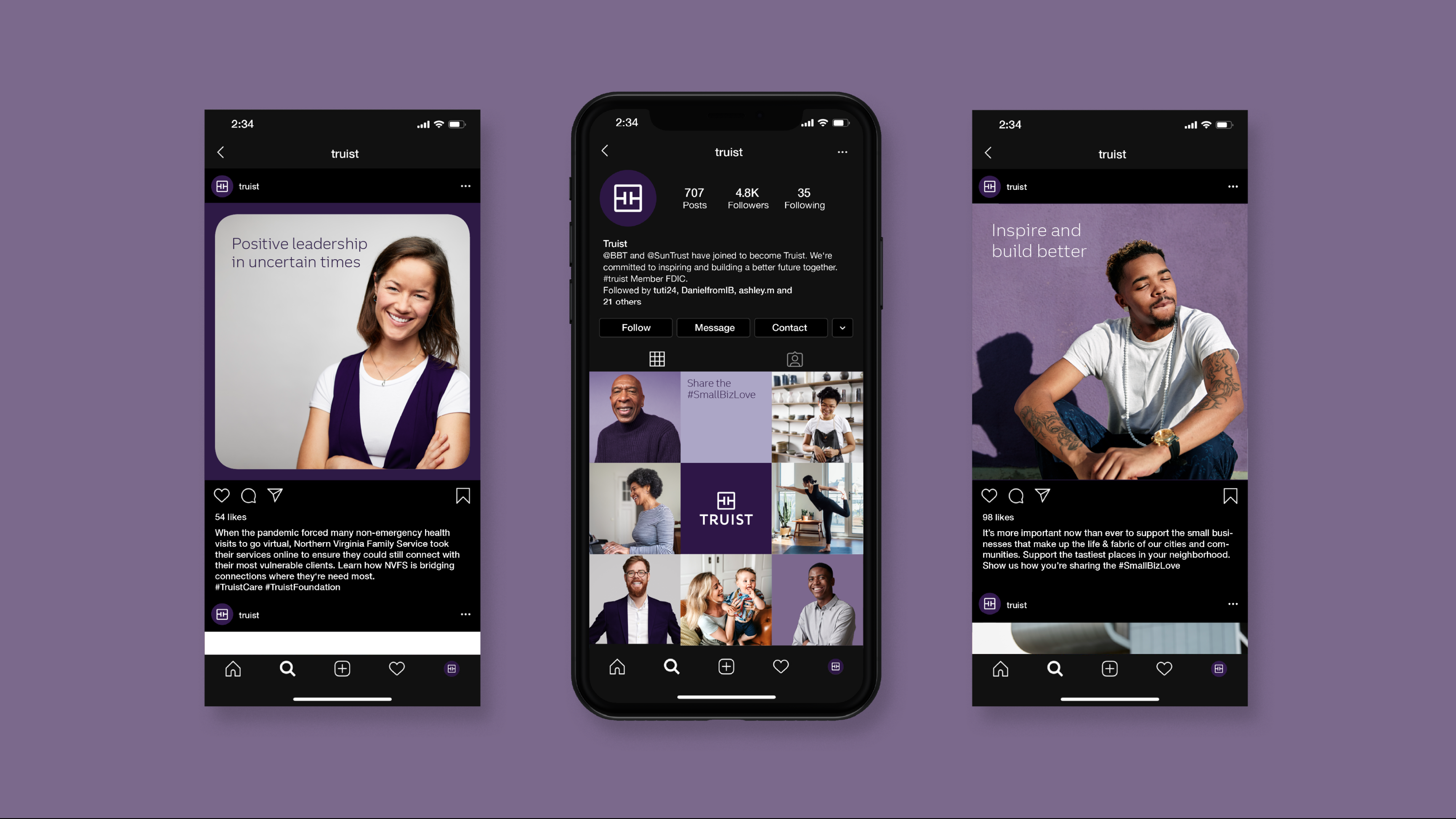
Created from the merger of BB&T and SunTrust, Truist aims to make impact by leading with purpose and delivering a financial experience that balances personal touch and advanced technology. Interbrand worked with them to define this new brand—its strategy, story, name, and identity.
Services: Brand Identity, Type Design, Motion Toolkit
Awards: Red Dot Winner Best of the Best (Truist Trio Typeface), Red Dot Winner (Corporate Identity), Transform Awards North America Silver Winner (Best corporate rebrand following a merger or acquisition & Best use of visual property), Highly Recommended (Best use of typography).
Credits
Client: Truist
Agency: Interbrand
ECD: Chris Campbell
CD/DD: Daniel Irizarry
Design: Liora Cher, Rory McKinnon, Ashley Min, Ross Norman, Tut Pinto, Claudia Sandoval, Sung Suh
Type Design: Dalton Maag
Strategy: Gigi Cheung, Daniella Giavina-Bianchi, Michael Marotta, Aneesh Sharma
CM: Alexa Ebner, Holmfridur Hardardottir, Alicia Hoffman, Will Shepard, Jessica Tsukimura
Verbal: Penelope Davis, Katherine Pissaro-Grant, Tori Miner
Motion: Daniel Irizarry
Implementation: Miguel Rivera, Robert Rosenberg
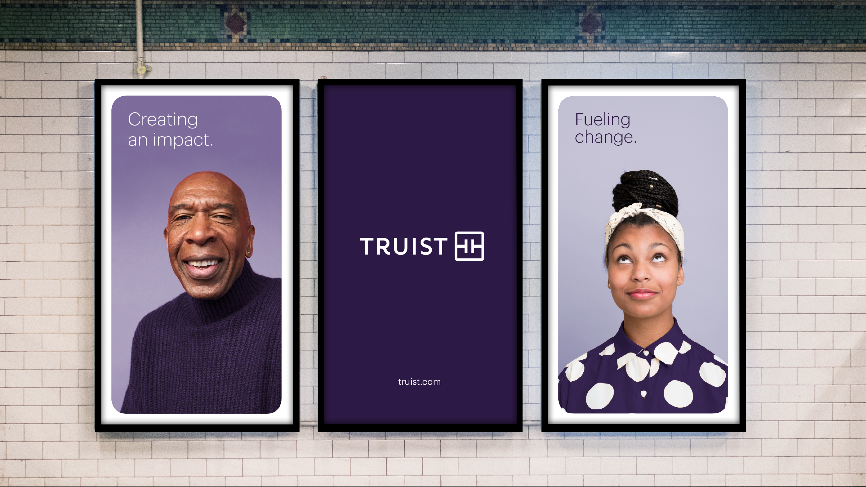
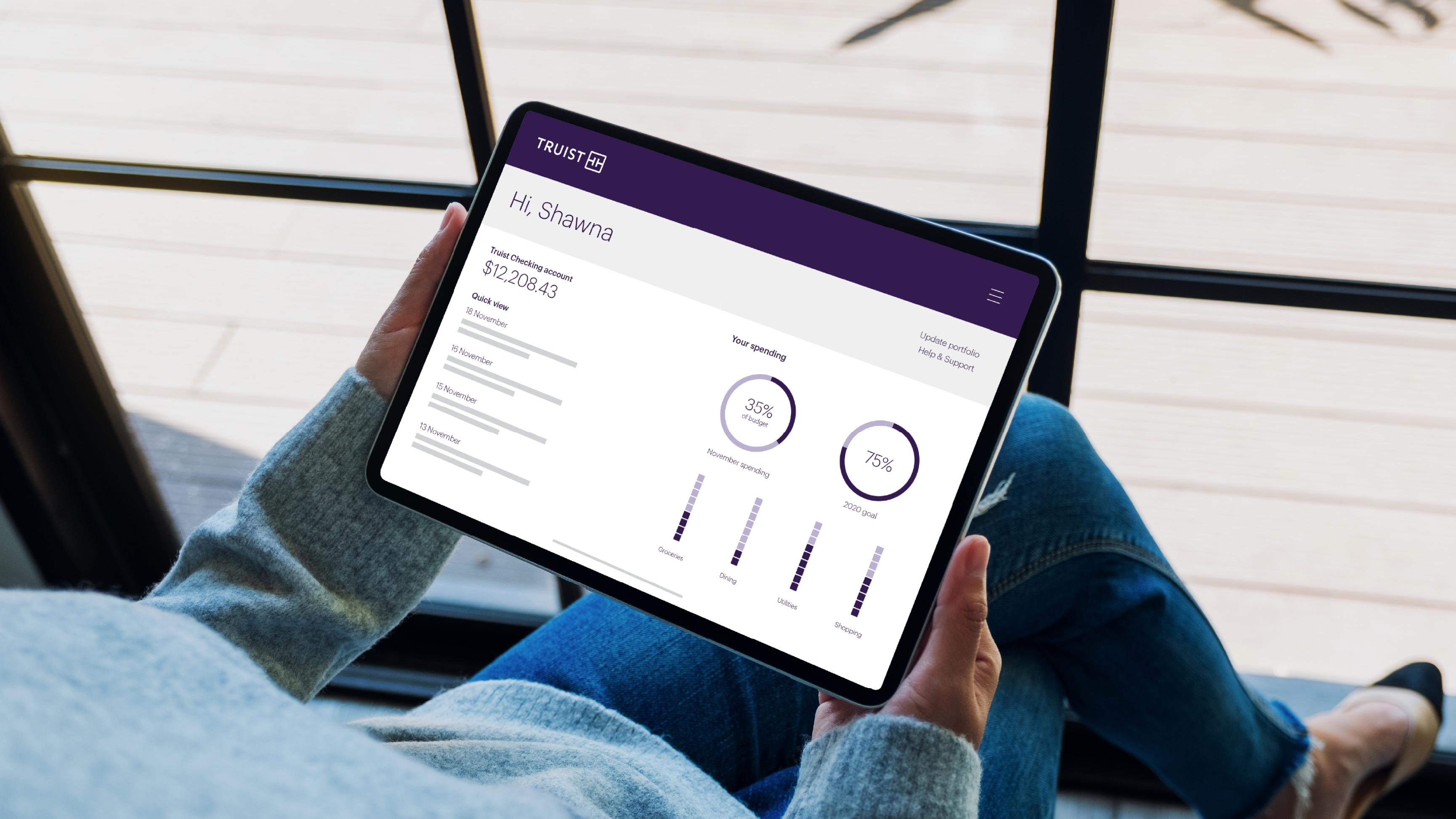
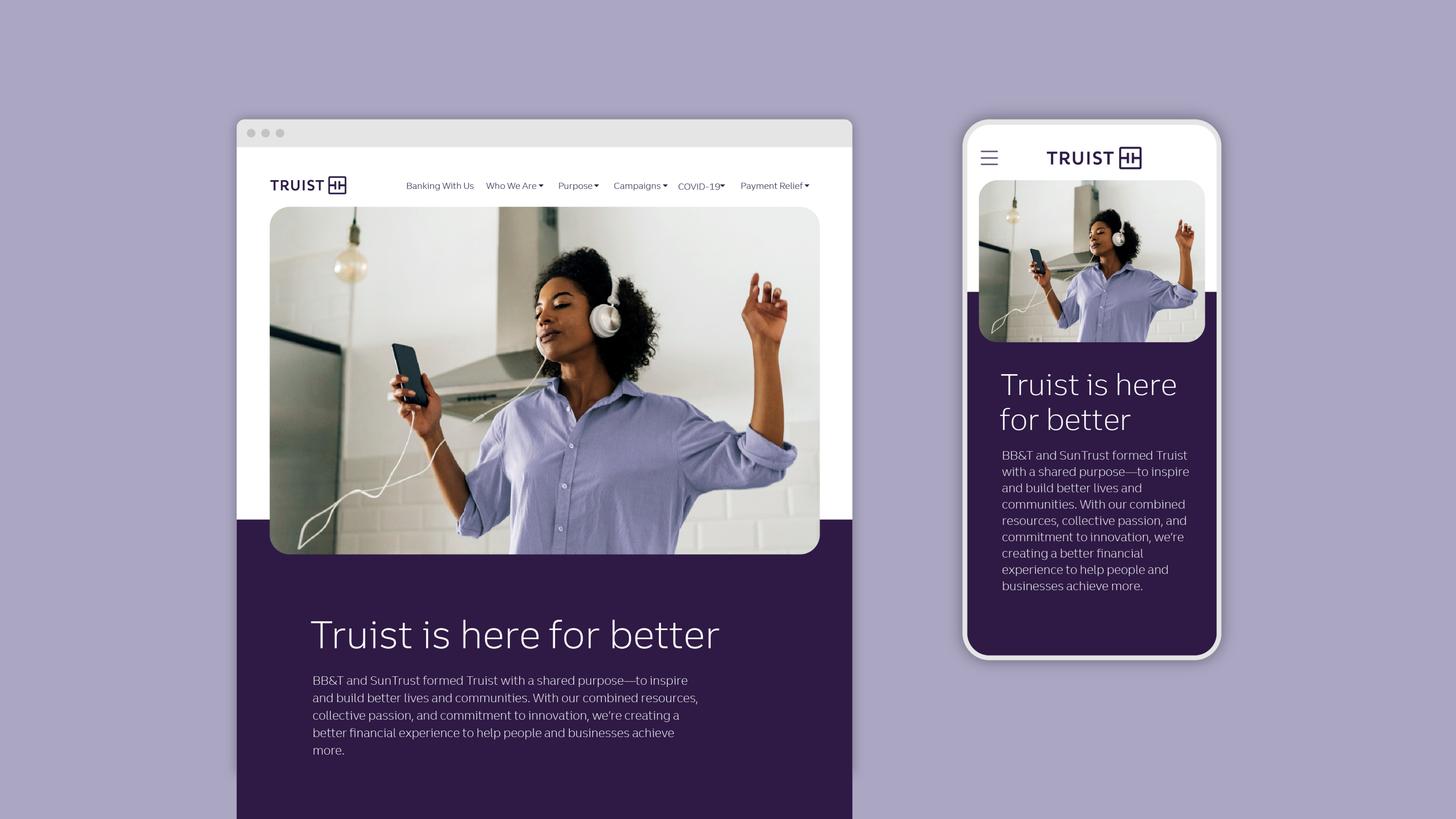
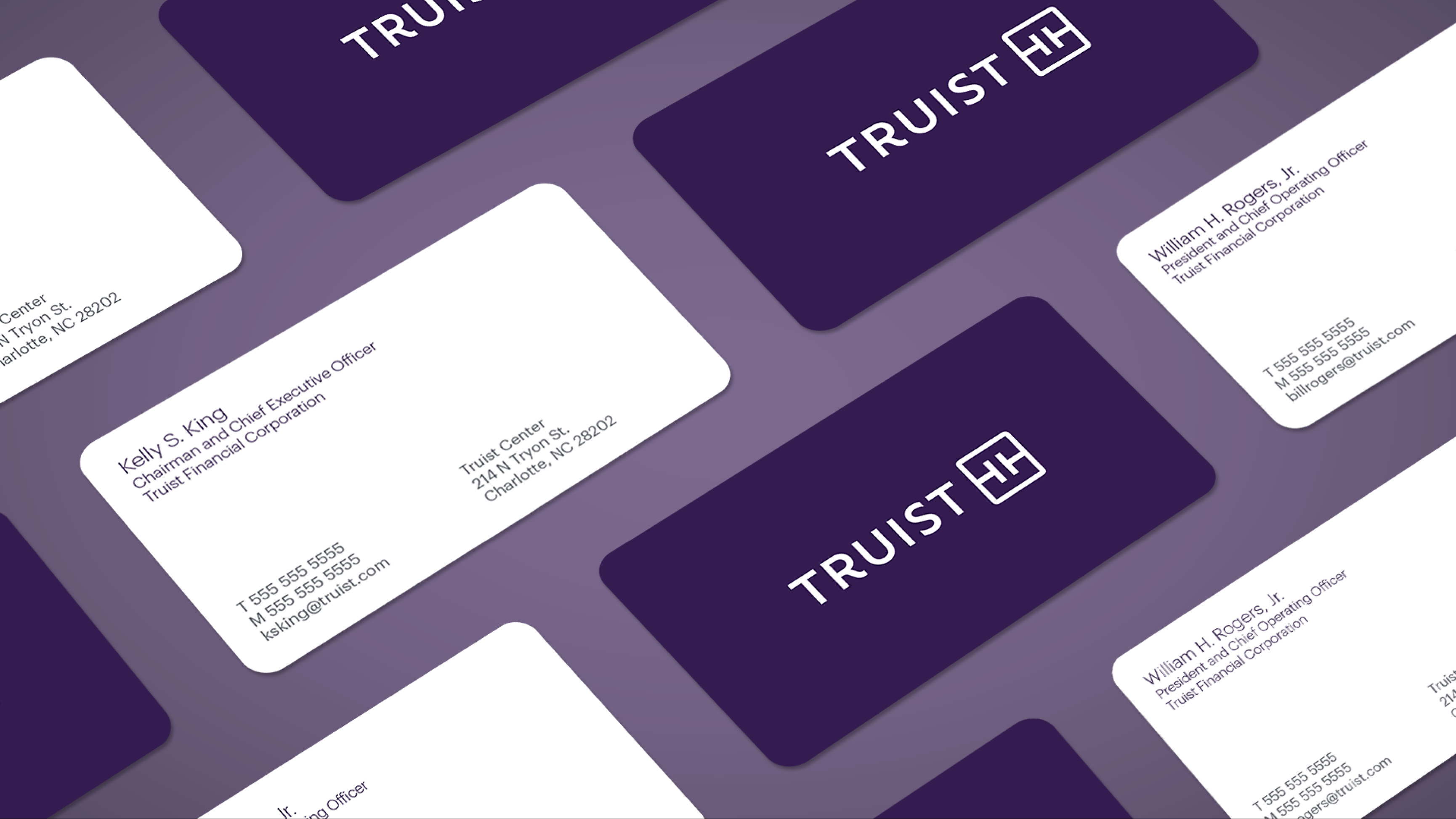
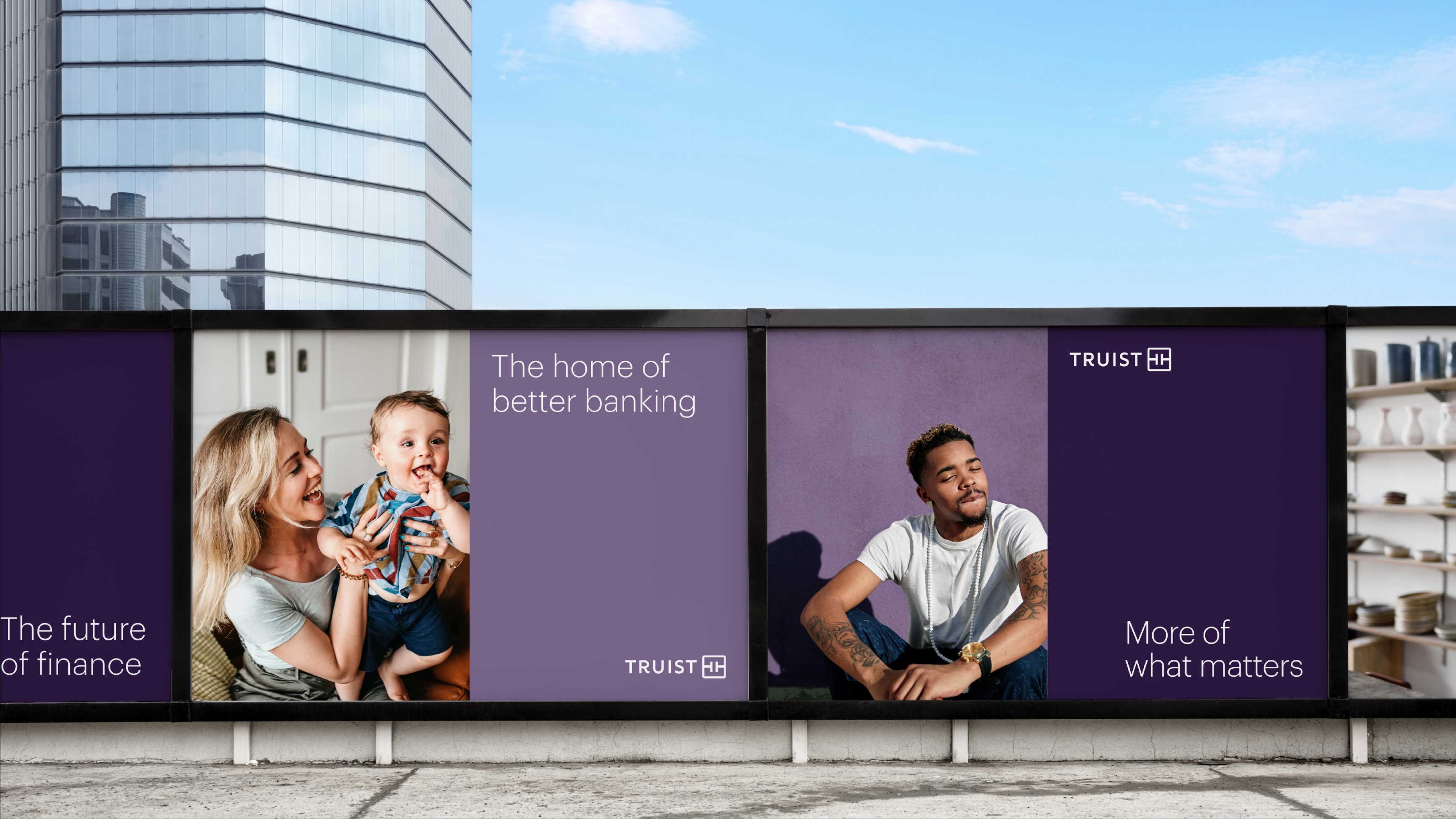
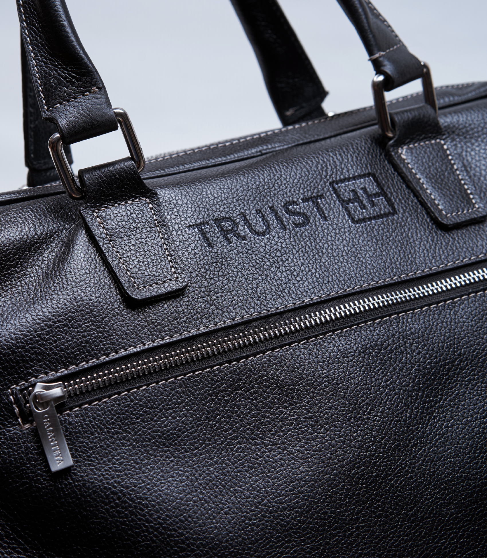
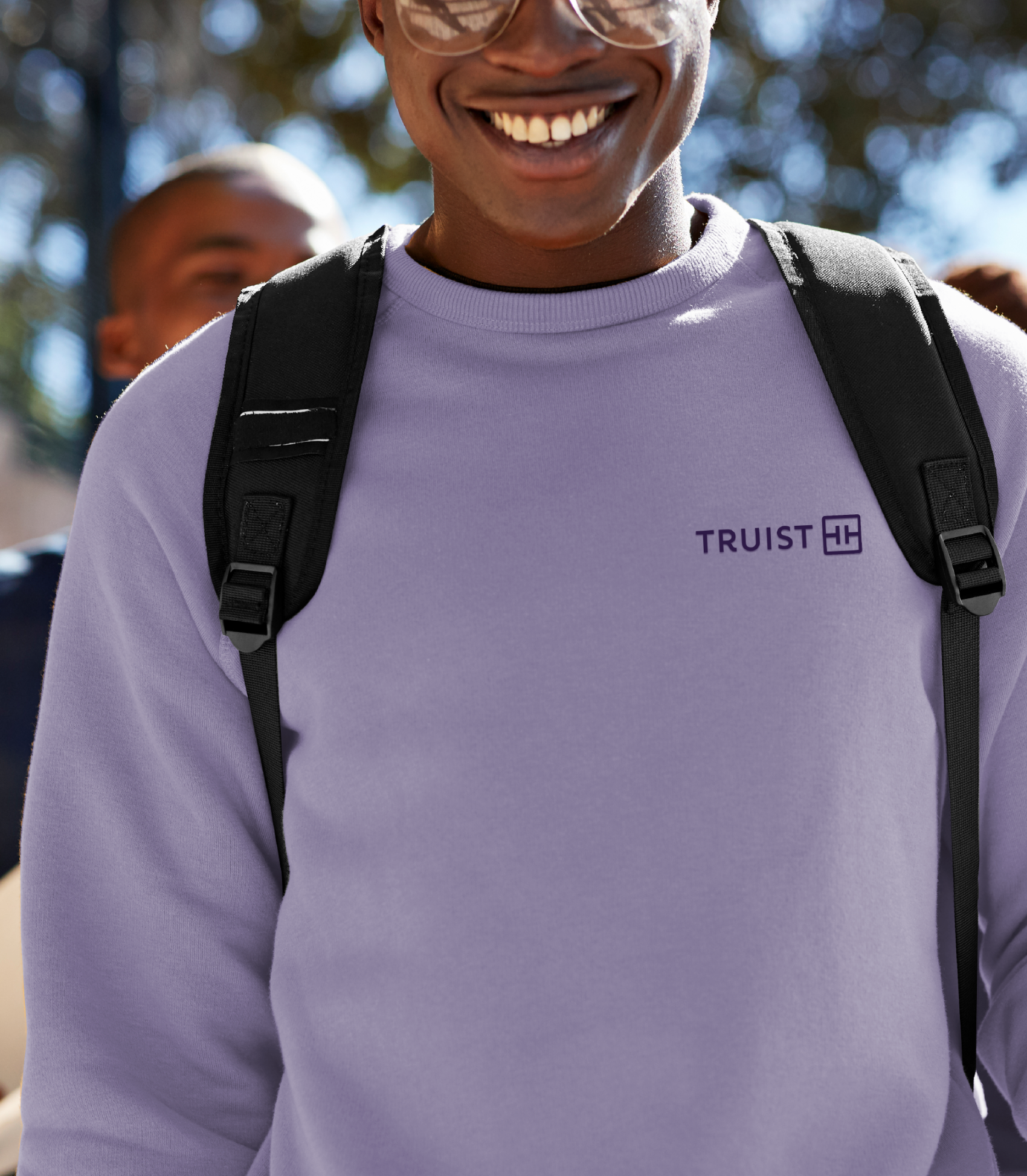
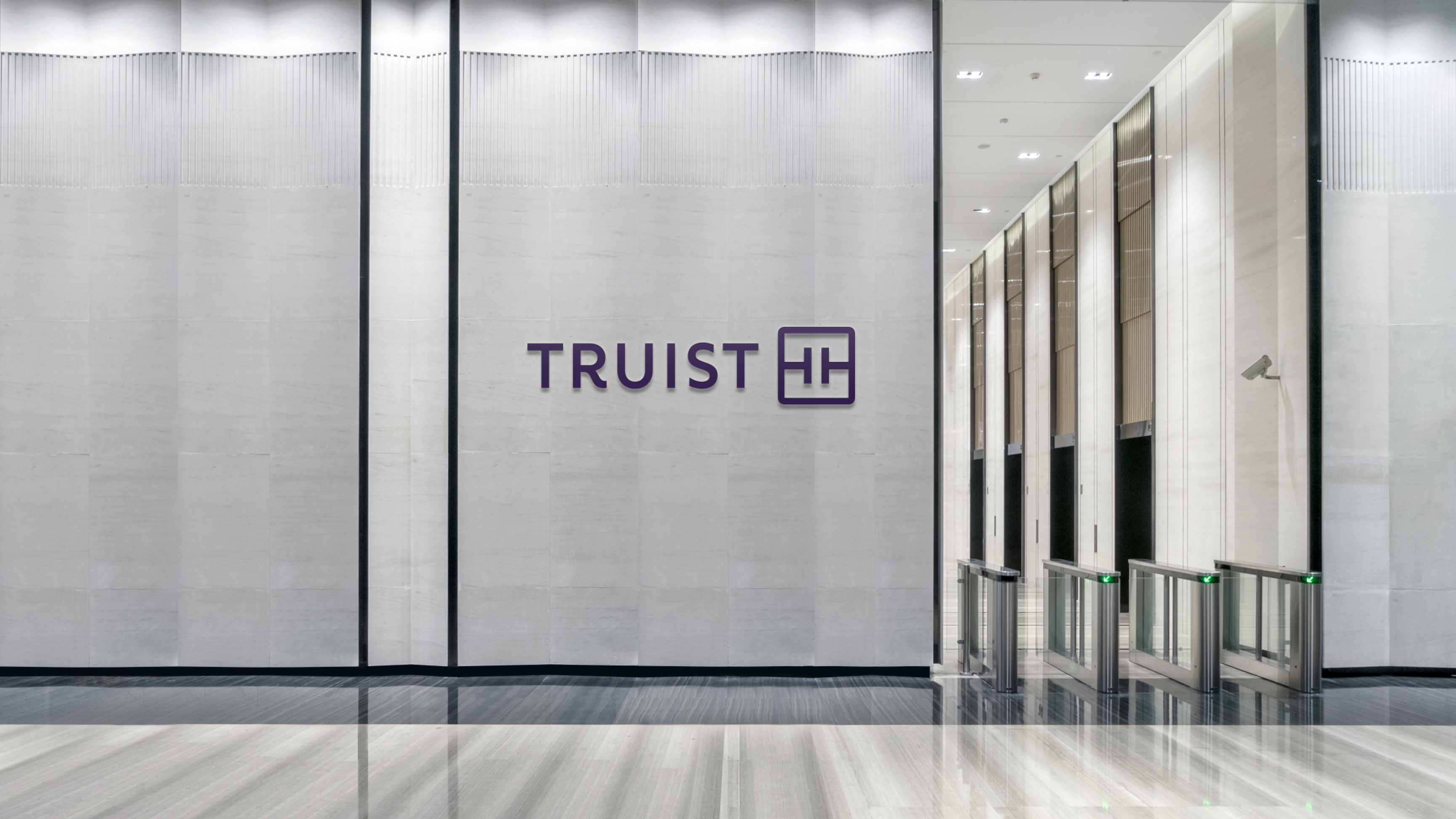
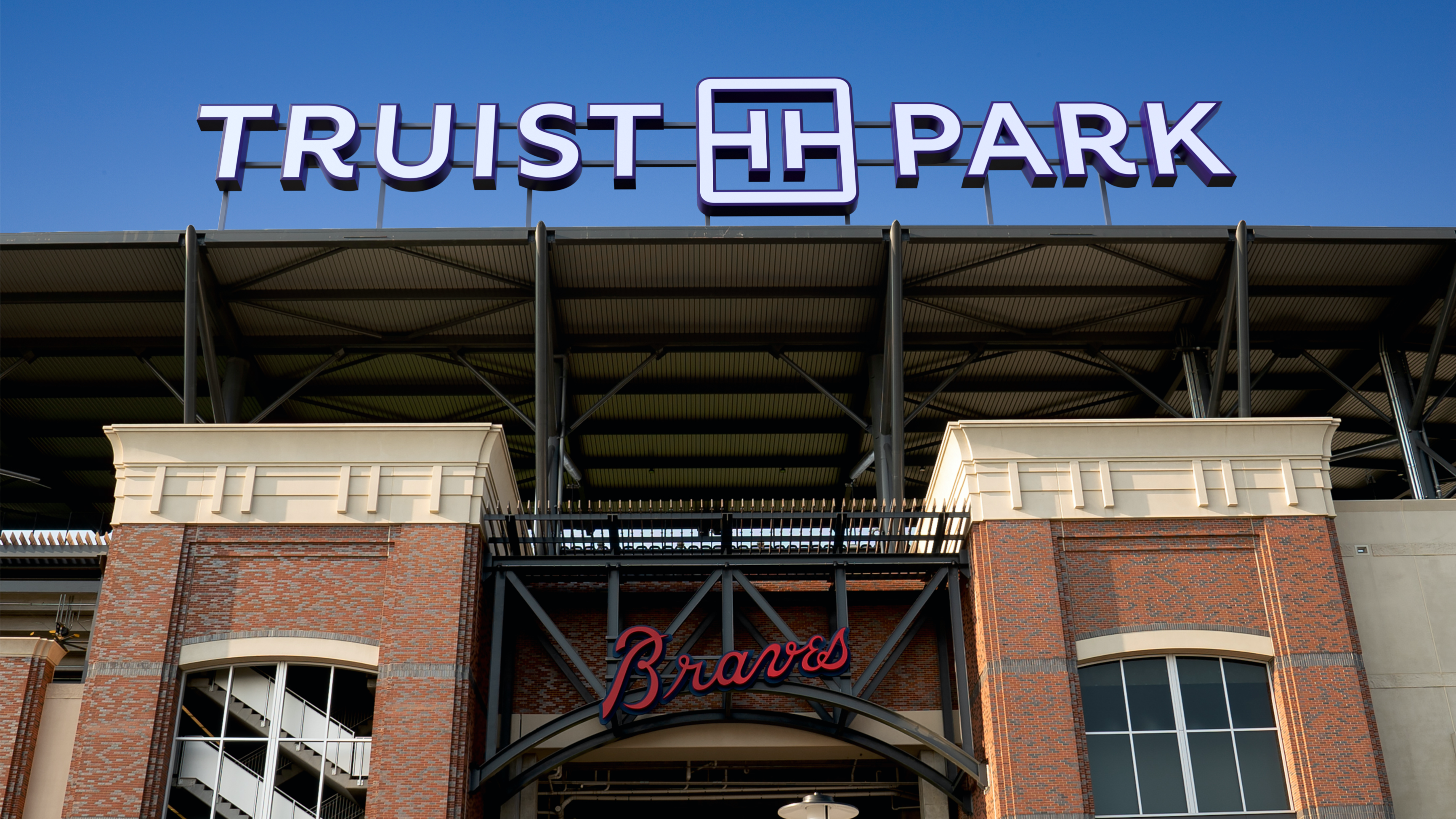
The logo leads with a wordmark that puts the Truist name front and center. As an invented word, the new name looks to the future while feeling familiar—it’s inspired by a commitment to being true, and the brand’s heritage of trust.
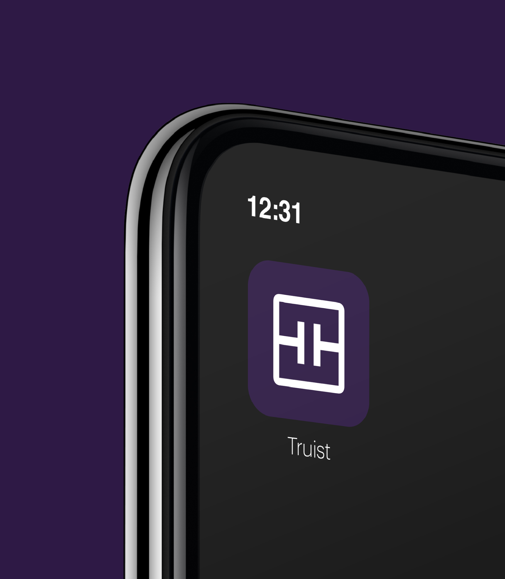
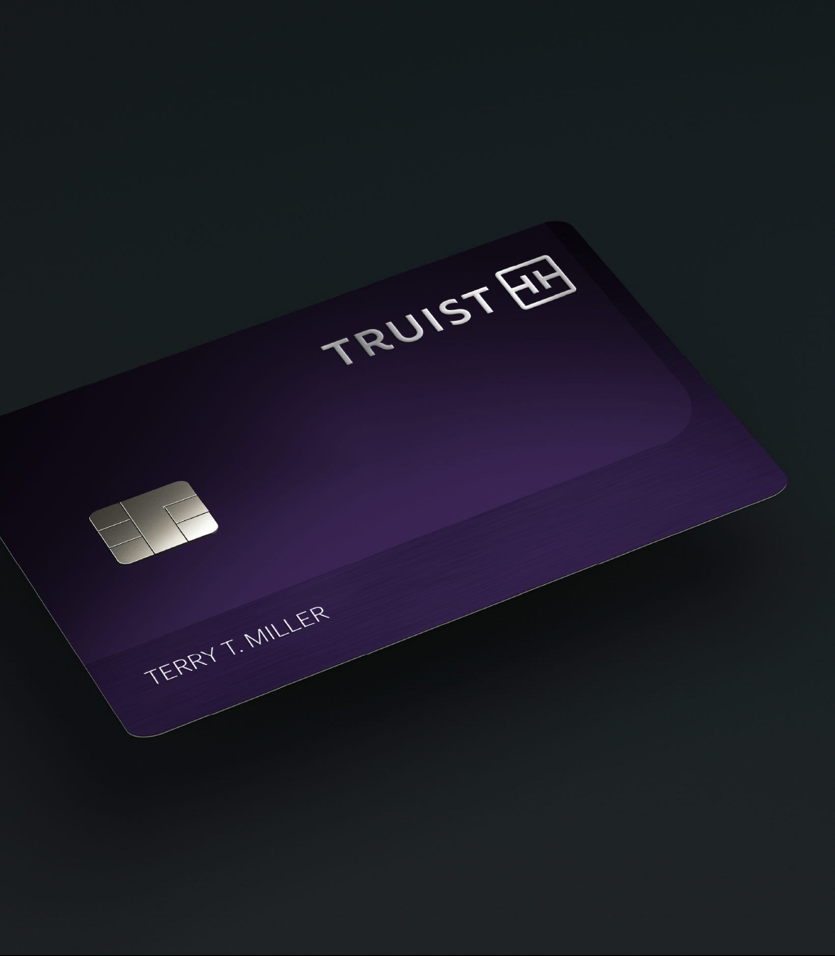
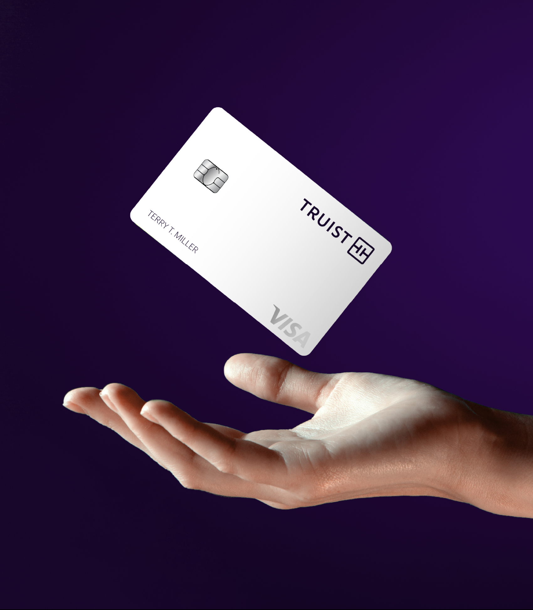
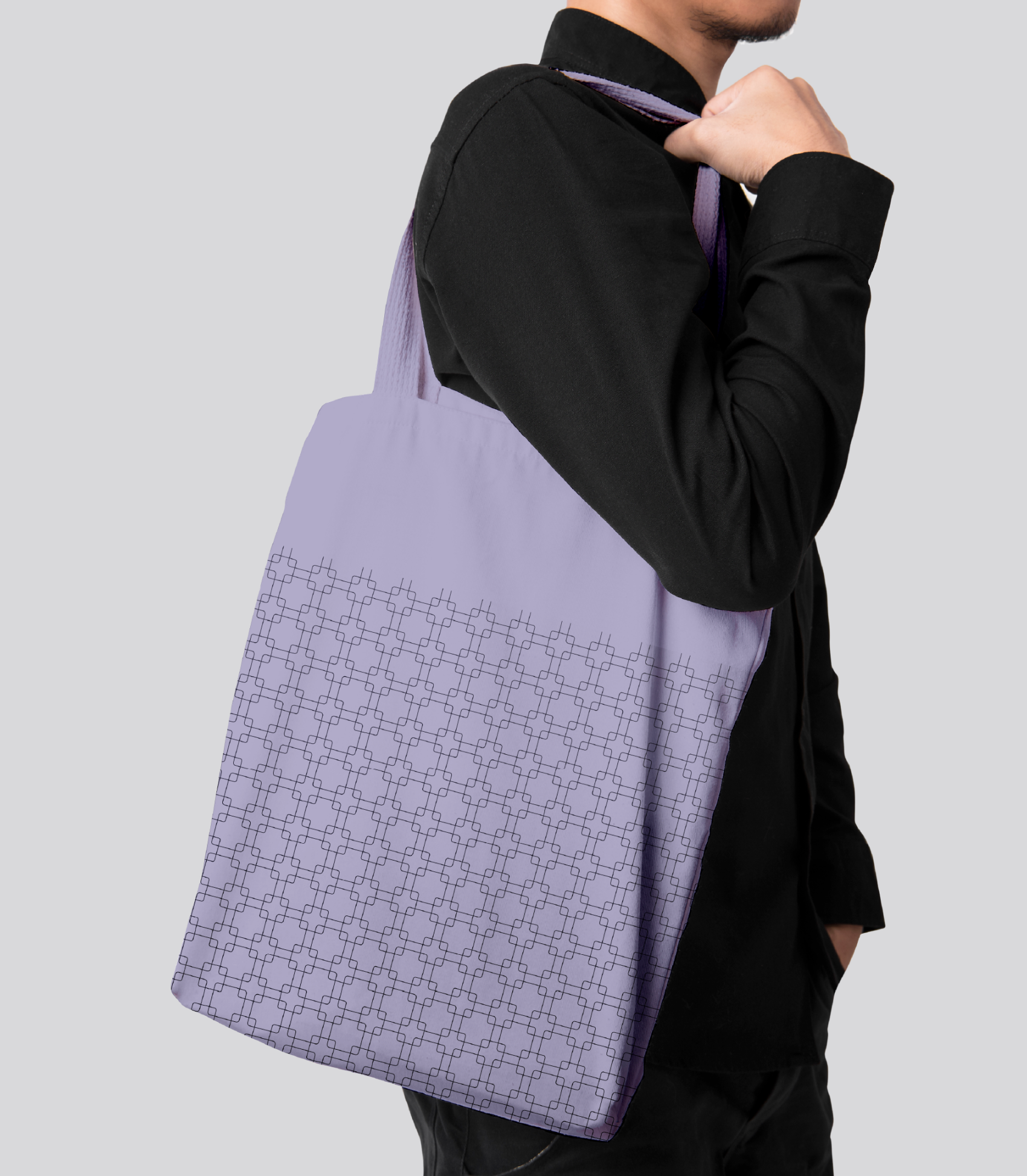
It’s complemented by the monogram, made of two T’s that echo the Truist name and represent the defining elements of touch and tech. They’re surrounded by a square with rounded corners that conveys trust, yet feels approachable. That ties to the generous letter-spacing of the wordmark (created by a master typographer), which conveys access and openness. The unique curved leg of the “R” moves the eye from left to right, evoking a sense of momentum toward the future.

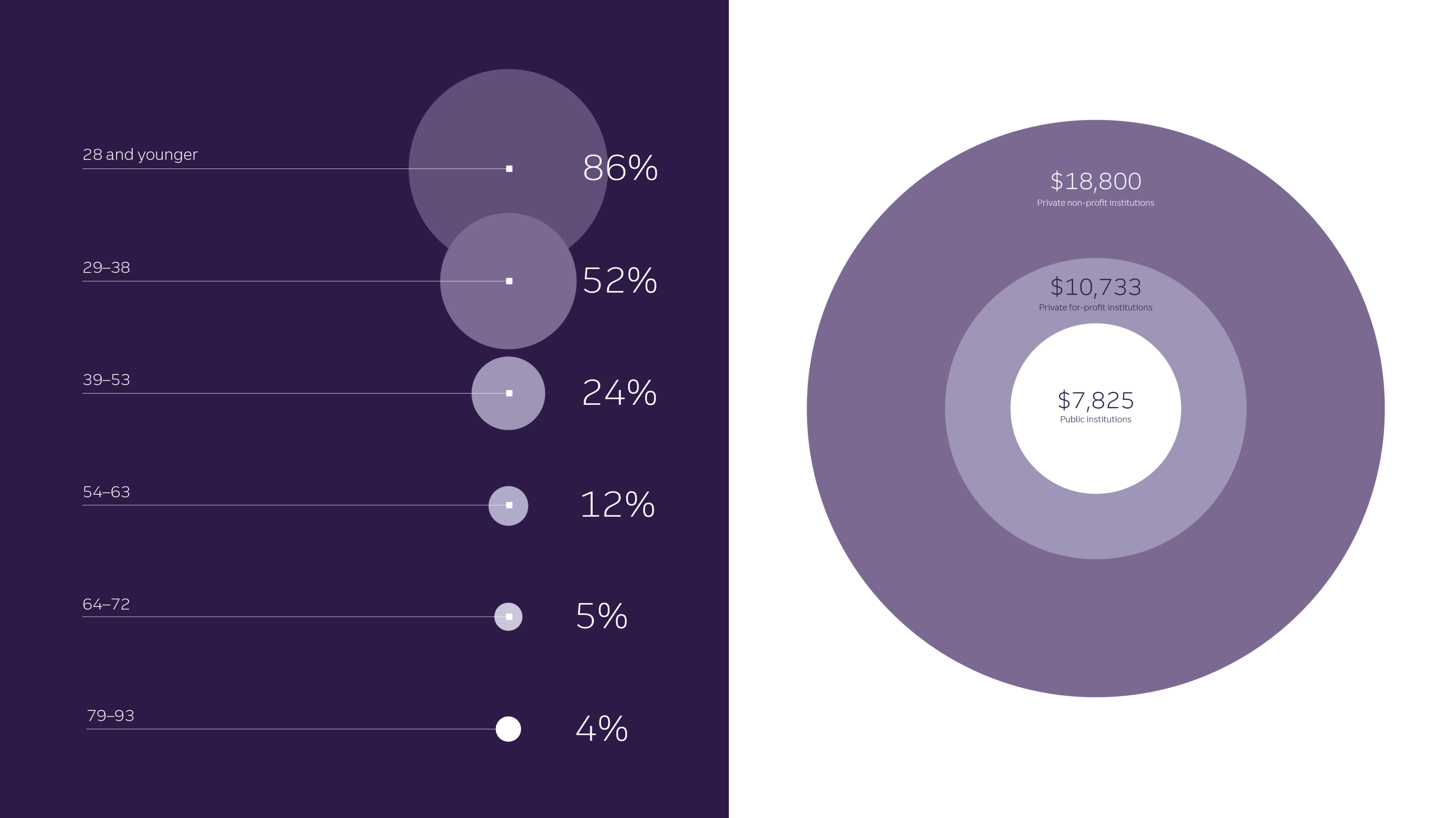
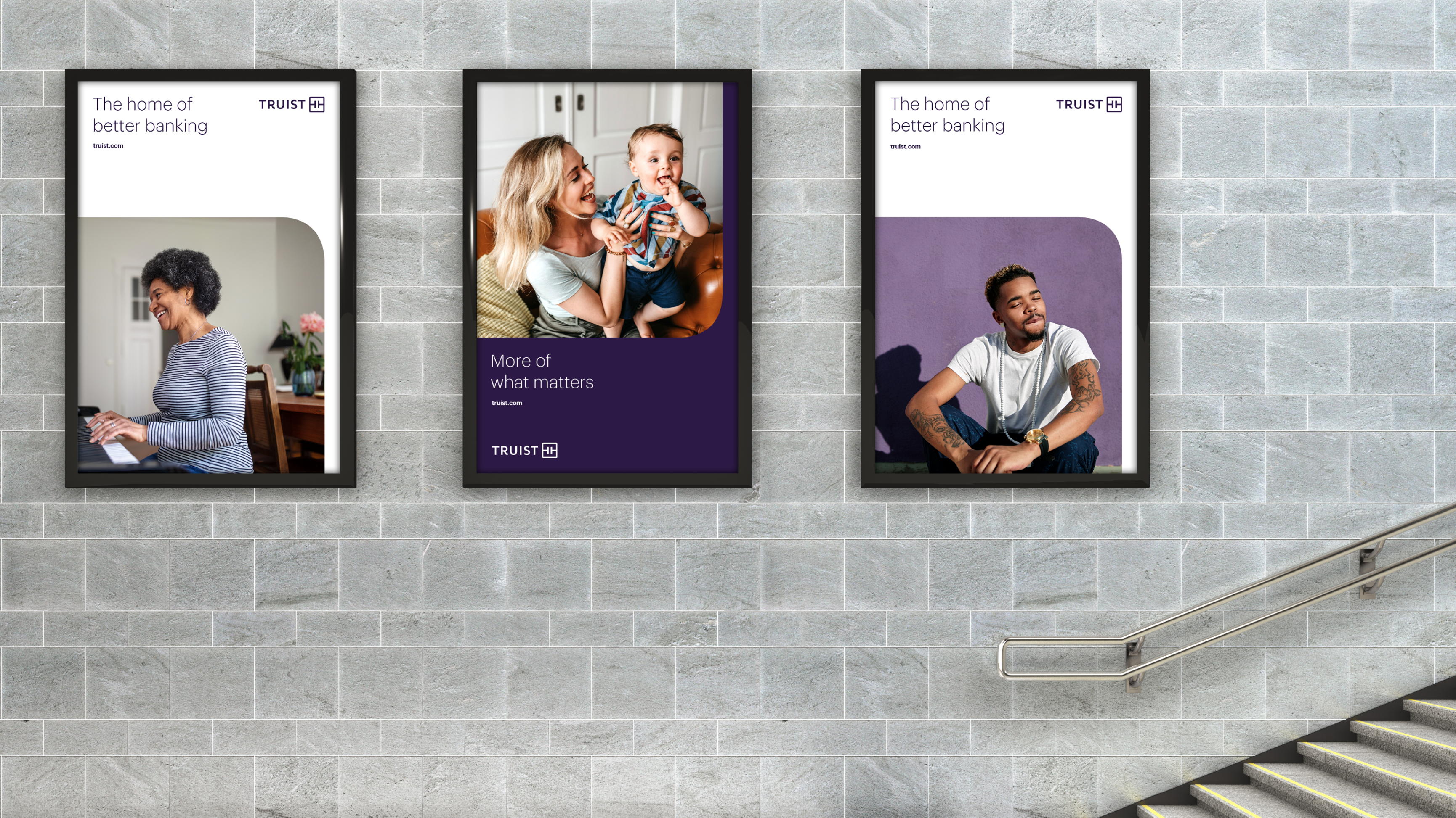
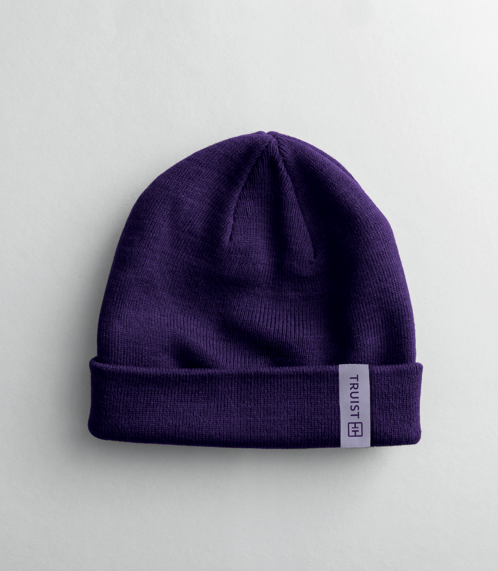
The brand’s signature color, Truist Purple, was designed to stand apart from category conventions. It also nods to the merger of equals by combining the burgundy of BB&T and the blue of SunTrust.
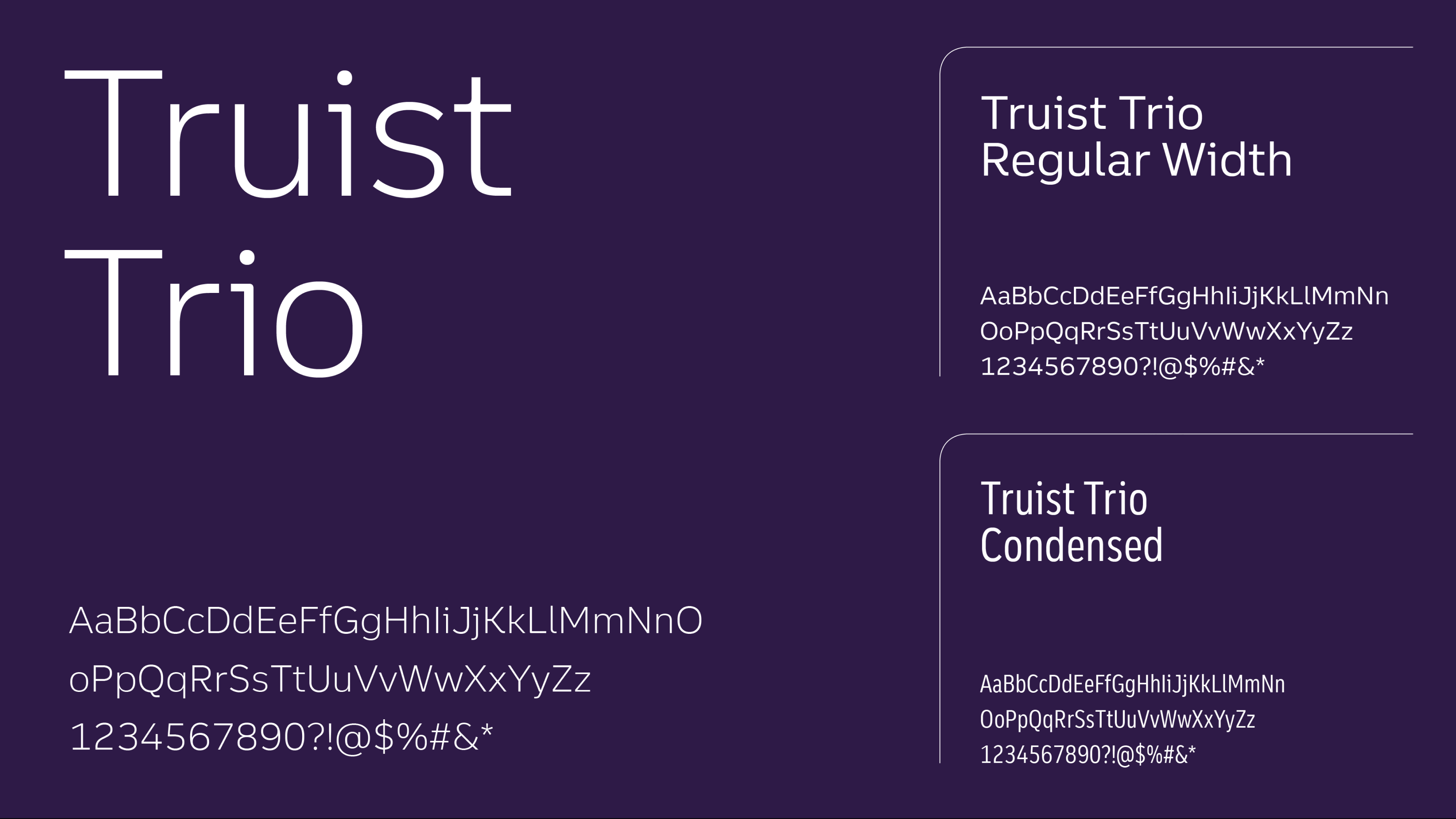
Truist Trio, the proprietary typeface, rounds out the toolkit for the new brand. It was designed to be fluid and intuitive to read, with a bit of the expressive flair and warmth that define the brand.
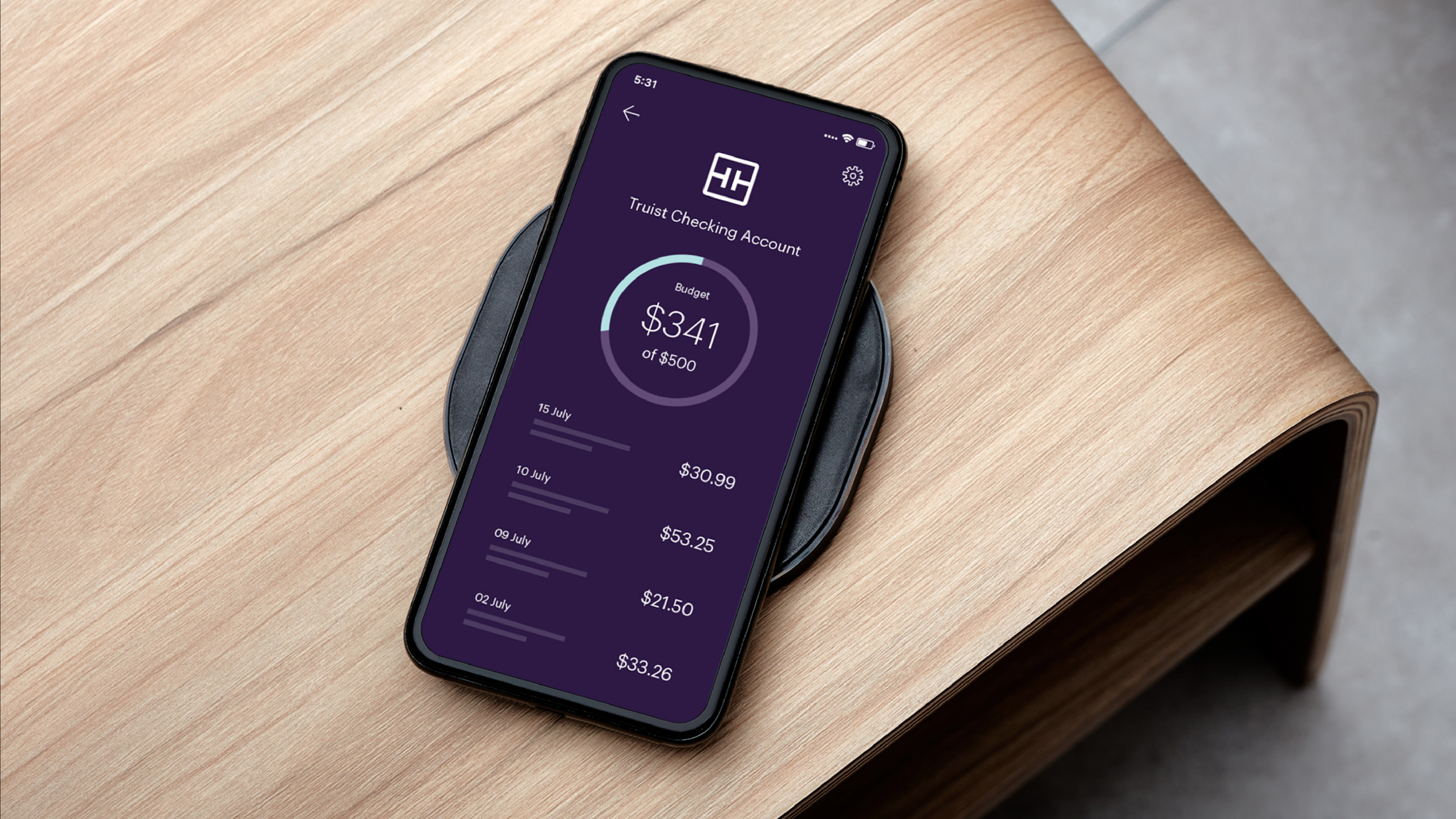
Together, they add up to an identity that represents the balance of innovation and purpose at the heart of Truist – helping clients, teammates, and communities thrive, while redefining the future of the financial industry.




DANIEL IRIZARRY
EMAIL —
the.daniel.irizarry@gmail.com
© 2025 Daniel Irizarry All Rights Reserved
All company, product, service names, logos, and brands are property of their respective owners and are for identification purposes only. Use of these names, logos, and brands does not imply endorsement.